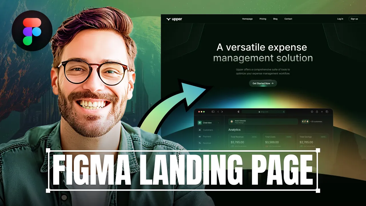
Stunning Landing Page Tutorial in Figma
68K62ojYSEA — Published on YouTube channel Viktor Oddy on August 15, 2024, 1:42 PM
Watch VideoSummary
This summary is generated by AI and may contain inaccuracies.
- We are designing a dark theme website for a SaaS company in Figma. We start by creating a frame, adding a logo, a button, and a description paragraph. Then we add a scroll wheel and a call to action button.
Video Description
Start earning $2,000 and get mentorship from me https://patreon.com/ViktorOddy
Transcription
This video transcription is generated by AI and may contain inaccuracies.
Today we're going to be creating a dark landing page for a SaaS company in Figma. Let's get into it. Start by creating a frame making it dark. As we are designing a dark theme website, use the text tool to type out our logo. Duplicate it and change to a smaller font for the navigation type, homepage, pricing, blog and contact. Duplicate again to create login and sign up buttons to make the sign up button stand out, add a stroke with a gradient for a cool effect. Replace the placeholder logo, aligning it to be 40 px spacing from both sides. Next, add a rectangle to create a bottom border that divides the menu from the hero section using a subtle gray color to avoid drawing too much attention. Duplicate the text, increase its size to 68 pixels and type a versatile expense management solution. Set the text to medium and add a gradient from white to opacity making it slightly visible. Decrease the line height. Duplicate this text to create the description paragraph. Set the size to 18 pixels. Duplicate the button and change the text to get started now add a blurred shape inside for a nice effect that can be animated later. Create a line at the top of the button for a running gradient effect. Place the screenshot of the app below the text. Add abstract shapes under the navigation to make the background more interesting. As a final touch, add a custom gradient effect behind the app. Duplicate the text to create a description for logos that will be placed under the screenshot. Duplicate the text one more time and change it to things users love about us. Make it smaller and fit it into two lines. I'll extend the artboard to fit the rest of our content. Let's grab the rectangle tool and create a rectangle 678 pixels by 440 pixels. Apply a gradient to it and start adding text. Add a title with a size of 20 pixels. Update the text content. Place the description below the title, make it smaller, set it to regular and ensure it fits into two lines. Place a screenshot of the app with a gradient for a seamless transition. Align everything perfectly. Group everything together. Duplicate the card, change the text and add another screenshot at the bottom well. Have three cards of similar size. Copy the text and place it into the card. The text will be shorter here at the bottom. Include a screenshot or a snippet of the app. Group this card, then duplicate it three times. Move the text to the bottom and place an image at the top. Lastly, duplicate the card one more time and update the text. Once that is ready, lets duplicate the text one more time and align it to the left side. Change the text. Next copy our two cards since this section will be quite similar, swap their positions so the shorter card is on the left and change the content of both cards. Move this whole section up and duplicate the text one more time to create another section. Let's create one wide card inside this card. Add a smaller headline and include a paragraph. Add two bullet points with checkmarks making the text bolden and white. Once this is ready, duplicate our button for a call to action. In this section on the left side of our content, we will have a screenshot of the app with a gradient in the background. Select the artboard and extend it below the card. We'll have two more cards. Change the text, place a screenshot with a gradient, extend the artboard, duplicate the headline, change the text. This will be the integration section showing pictures of different companies on the right side. Next up we will have testimonial section for testimonials duplicate the text to create a card where we have a review. Place a quote at the top. Write some bolder numbers using this green color and a short description below the numbers. Use the rectangle tool to create a very subtle divider. Add avatar on the left side the name and description. Once the card is ready, group everything together and duplicate it to have one more card next to it. Next we will have a CTA section. Create a rectangle with rounded corners. Copy the text and add a gradient to the background. Add lines on the top as well as the button under the text for the footer. Duplicate the logo and place it under the call to action. Duplicate some text for links. Once that is ready, use the rectangle tool to add copyright information at the bottom. After that, our website will be ready. If you enjoyed this video, please give it a like and subscribe. This helps other people discover this content. See you in the next one.
